
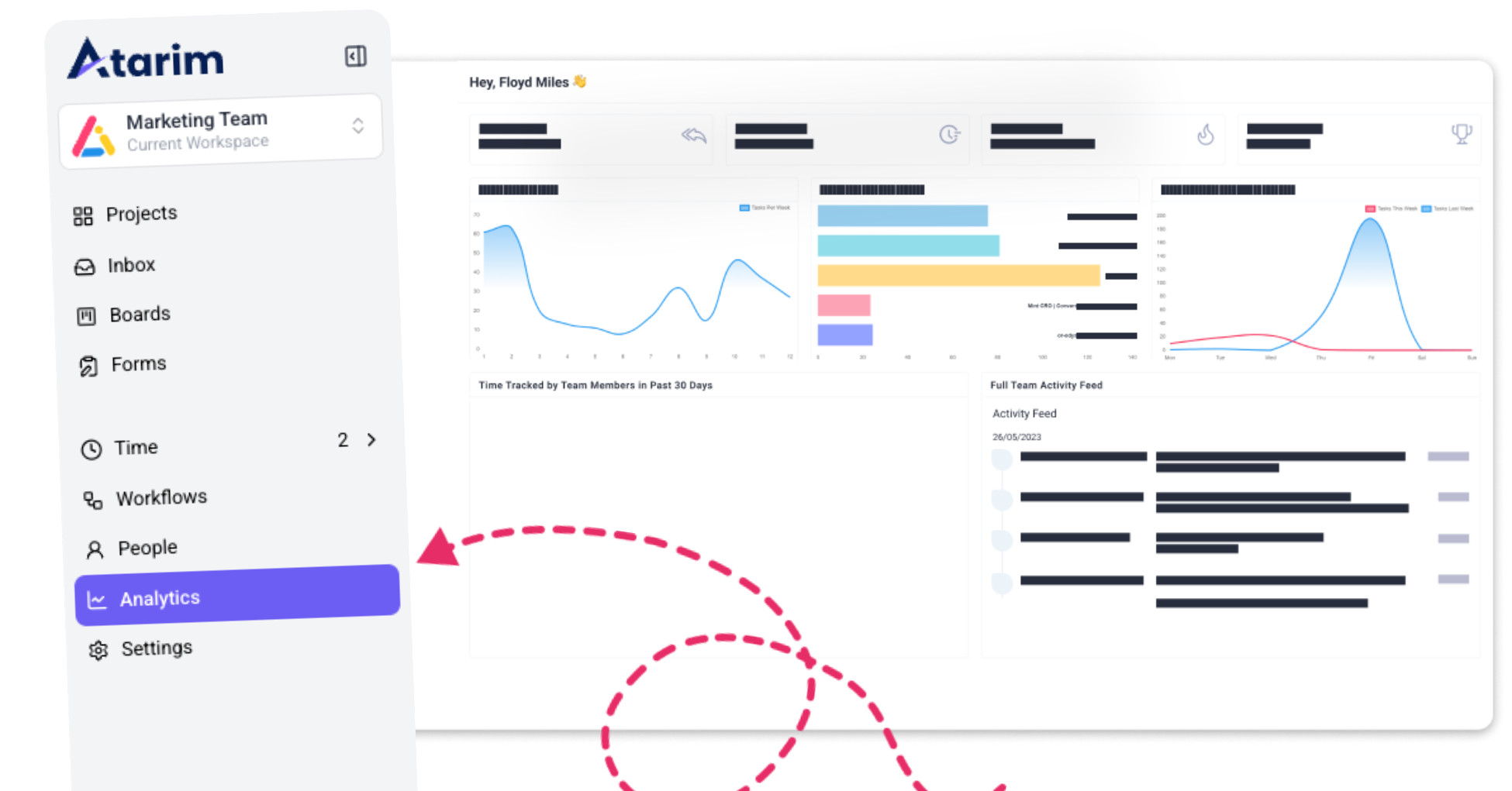
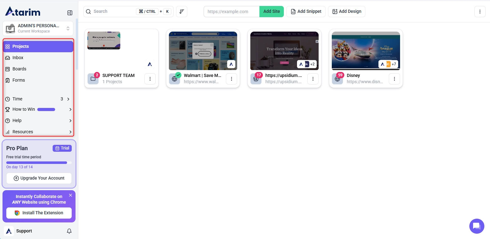
1. Accessing the Analytics Dashboard
The Analytics tab helps you review project progress, task activity, response times, and team performance from one place.
Instructions:
- Log in to Atarim and navigate to your workspace.
- Click the Analytics tab from the main menu.
- The Analytics dashboard will open.
- Use the available tabs to switch between Overview, Projects, and Team.
- Review the metrics, tables, and graphs shown in each section.
Tip: Use filters to focus on specific projects, users, or time periods when reviewing performance.
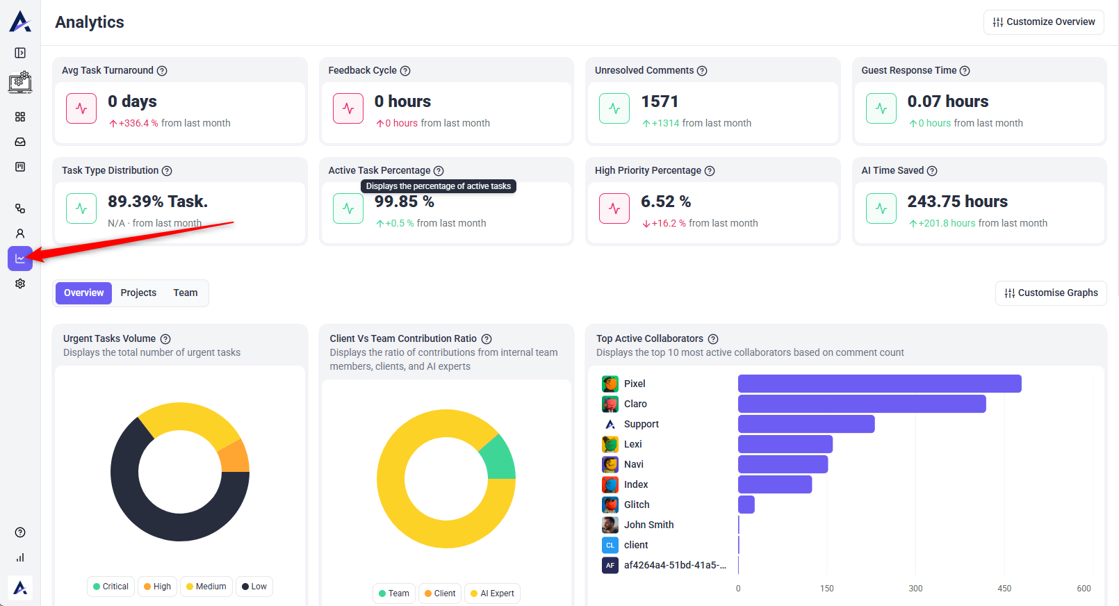
2. Understanding Key Metrics
The Analytics dashboard includes several key metrics that help teams understand workspace performance.
Average Task Turnaround
Shows the average time it takes for tasks to be completed. This helps teams understand how quickly work is being resolved.
Feedback Cycle
Shows how long it takes feedback to move through the review process. This is useful for identifying slow review cycles or delays.
Unresolved Comments
Shows the number of comments created during the selected period where the related task has not yet been completed. It also compares this number with the previous period so you can track whether unresolved feedback is increasing or decreasing.
Guest Response Time
Shows how quickly guests or clients respond. Faster response times can help keep projects moving.
Task Type Distribution
Shows the percentage of task types across the workspace. This helps you understand what kind of work is being created most often.
Active Task Percentage
Shows the percentage of tasks that are currently active. This helps teams monitor the amount of ongoing work.
High Priority Percentage
Shows how many tasks are marked as high priority. This helps teams identify urgent or important workload trends.
AI Time Saved
Shows estimated time saved through AI activity and assistance in the workspace.
Note: Metrics are most useful when reviewed together. For example, a high number of unresolved comments combined with a long feedback cycle may indicate that reviews are slowing down or tasks are not being followed up quickly enough.
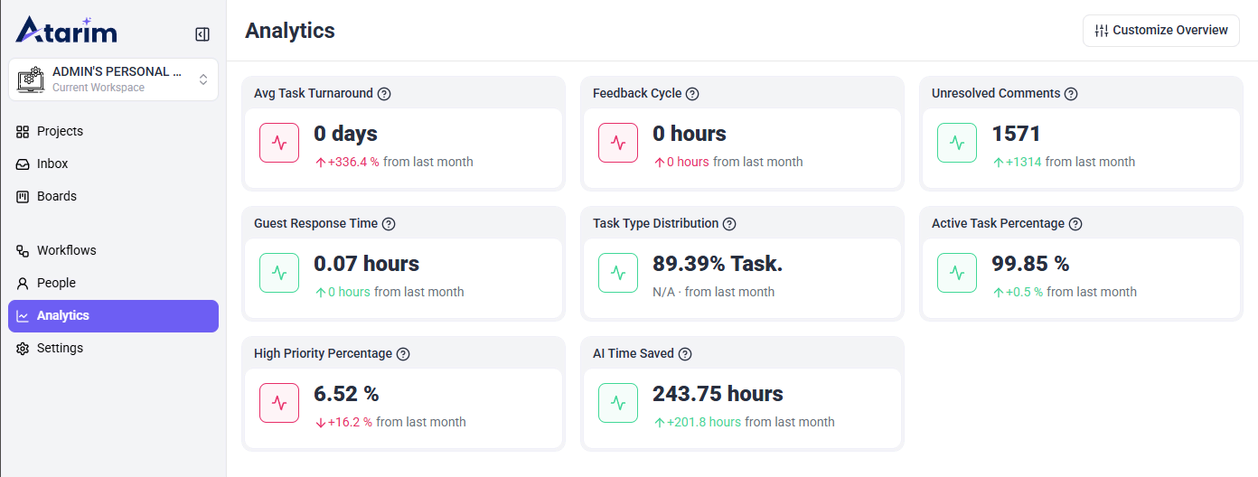
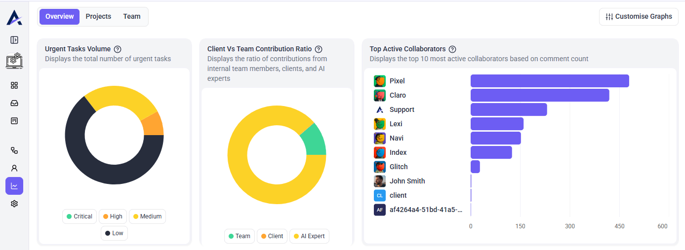
3. Overview Graphs
The Overview tab includes charts that help you understand task volume, collaboration patterns, user activity, and workspace trends.
Urgent Tasks Volume
Displays the total number of urgent tasks by priority level, such as Critical, High, Medium, and Low.
Client vs Team Contribution Ratio
Shows the ratio of contributions from internal team members, clients, and AI experts.
Top Active Collaborators
Shows the top active collaborators based on comment count.
Tasks Per User
Displays the number of tasks assigned to each user. This helps managers review workload distribution across the team.
Inner Circle Participation
Shows the number of AI response comments per user in the workspace. This helps track AI agent participation and activity.
Activity Trend
Displays daily activity from comments and tasks over time. Use this to identify spikes in activity, busy review periods, or slower periods.
Most Active Projects
Shows the projects with the highest activity levels across your workspace. This helps identify which projects are receiving the most updates, comments, or task activity.
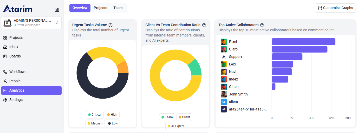
Tip: Use the graphs to spot patterns at a glance, such as which projects are most active, which users have the most assigned tasks, or when collaboration activity increases during the week.
Additional Overview Graphs
The Overview tab may also include additional graphs that give a deeper view of team activity, task distribution, and workspace engagement.
Tasks Per User
Shows the number of tasks assigned to each user. This helps managers review workload distribution and identify who may have more open work assigned.
Inner Circle Participation
Shows the number of AI response comments per user in the workspace. This helps track how often AI agents or team members are contributing to task discussions.
Activity Trend
Shows daily activity from comments and tasks over time. Use this to understand when the workspace is most active and identify spikes in collaboration or task activity.
Most Active Projects
Shows the projects with the highest activity levels across the workspace. This helps teams quickly identify which projects are receiving the most comments, tasks, or updates.
4. Projects Analytics
The Projects tab provides a project-level view of performance and progress.
This section may include:
- Project name
- Total tasks
- Project creation date
- Progress
- Current project stage
- Status distribution
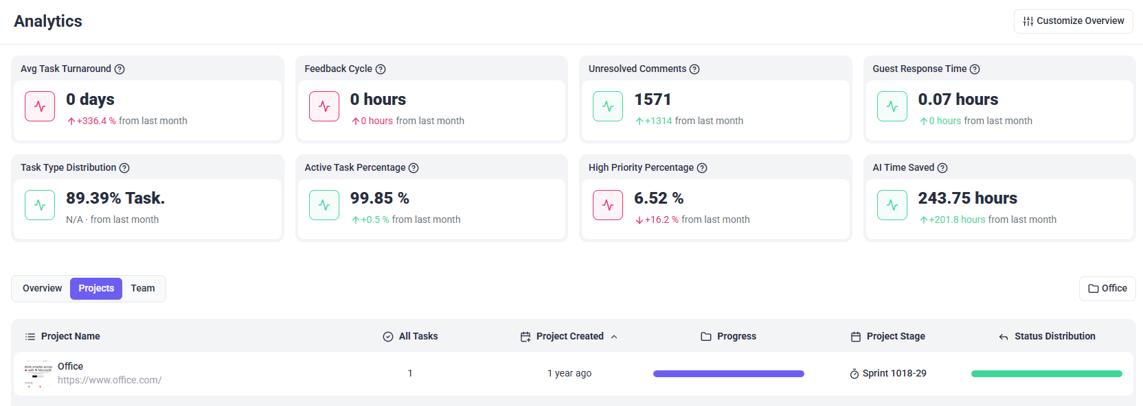
Use this view to see which projects are moving forward, which projects have open work, and which ones may need attention.
5. Team Analytics
The Team tab shows analytics by user.
This section may include:
- User name
- User role
- Tasks completed
- Open tasks
- Associated projects
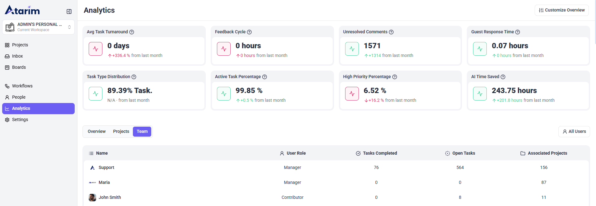
Tip: Use the Team tab to review workload balance across users. If one team member has many open tasks while others have fewer, you may need to adjust assignments or priorities.
6. Customizing the Analytics View
Depending on your workspace setup, you may see options such as:
Customize Overview
Allows you to adjust which metrics appear in the overview section.
Customize Graphs
Allows you to choose or update which graphs are displayed.
Note: Use these options to focus the Analytics dashboard on the metrics that matter most to your team.
7. How Analytics Helps Optimize Workflows
Atarim’s analytics provide actionable insights that help teams:
Identify Bottlenecks
Spot where tasks, comments, or reviews are slowing down.
Improve Time Management
Understand where time and effort are being spent across projects.
Enhance Team Performance
Review workload distribution and adjust assignments when needed.
Boost Client Engagement
Monitor guest response times and unresolved feedback to keep collaboration moving.
Track Project Progress
Review project stages, status distribution, and overall task activity.
Improve Reporting
Use analytics during internal reviews, client updates, and project planning sessions.
Recommendation: Review analytics regularly to make data-driven decisions and improve team workflows.
FAQs
Workspace admins and team members with the appropriate permissions can access analytics
Review Analytics regularly during weekly check-ins, sprint planning, project reviews, or client reporting to spot blockers and track progress.
Yes. Use the Projects tab to review project-level progress, total tasks, project stages, and status distribution.